
Hazard warning decals play a crucial role in workplace safety. These visual alerts communicate critical information that can save lives and prevent injuries. Understanding how color and symbols enhance the effectiveness of these decals can improve hazard communication and ensure compliance with safety standards.
The Fundamentals of Warning Decals
Warning decals are the unsung heroes of workplace safety. At their core, they are adhesive visuals—often stickers or signs—designed to grab attention and convey essential safety information quickly and efficiently.
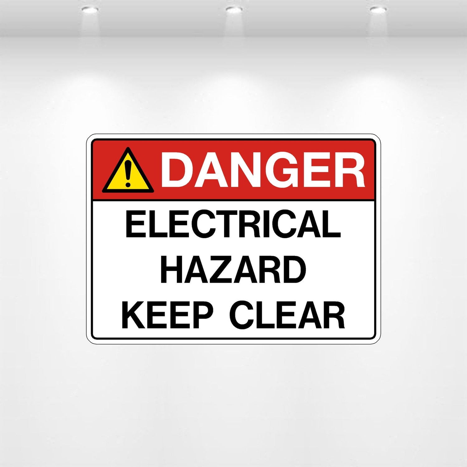
A quick glimpse at a bright red "Danger: High Voltage" label, for example, instantly communicates life-saving information without requiring lengthy explanations. This immediacy is exactly why they are considered an integral component of hazard communication systems and why so many safety standards (like those set by OSHA and ANSI) emphasize their proper use. They’re more than signs; they’re safeguards.
The Role of Color in Hazard Warning Decals
Imagine walking into a factory where every warning decal is a bland shade of gray. No matter the risk—be it a live electrical wire or a hazardous chemical spill—each alert looks the same. The sheer monotony would make it nearly impossible to gauge urgency or differentiate between potential hazards. That’s where the strategic use of color steps in, transforming cluttered warnings into clear, life-saving guidance.
Colors in hazard warning decals aren’t chosen arbitrarily—they’re a language of their own, conveying risk levels at a single glance. Consider red, perhaps the most instantly recognizable of warning hues. In the realm of safety decals, red screams, “Stop!” It signifies an immediate danger, such as a fire hazard or a prohibition that, if ignored, could lead to dire consequences. A decal with a red background or red text doesn’t give you the luxury of deliberation; it demands immediate attention and decisive action.
Then there’s yellow, the cautious cousin of red. Yellow doesn’t demand you stop in your tracks, but it advises you to pay attention. It whispers of potential hazards—a slippery floor, for instance, or machinery that may activate unexpectedly. Unlike red, which thrives on urgency, yellow gives you a window to evaluate and navigate risks, maintaining a mutual understanding: proceed, but proceed carefully.
Orange, on the other hand, walks the middle ground between red's alarm and yellow's caution. Often used to highlight moderate yet significant risks, orange decals alert workers to dangers that require action but aren’t as immediately critical as those flagged in red. Think of exposed machinery parts or construction zones—a firm but reasonable nudge to be alert and focused.
These color conventions aren't mere preferences; they’re firmly rooted in globally recognized standards like OSHA (Occupational Safety and Health Administration) and ANSI (American National Standards Institute). According to their guidelines, each color is tied to a specific hierarchical level of risk. Such consistency means workers can rely on these cues regardless of their background, experience, or even geographic location. The understanding of a red “DANGER” symbol or a yellow triangle marked “CAUTION” is nearly universal, creating an intuitive safety network.
The Significance of Symbols in Hazard Communication
Imagine walking into a noisy factory floor where instructions barked through a loudspeaker would be swallowed by the din of machinery. Now imagine you don't speak the local language. How do you ensure your safety? This is where symbols step in, offering universal clarity in a way that words—or even colors alone—might fail.
Symbols are the quiet workhorses of hazard communication. Regardless of the industry, they distill complex safety messages into a single, universally understood image. A skull and crossbones instantly signals "toxic" to everyone, from chemists to custodians, while the flame icon universally warns of flammable substances. These images transcend language barriers, cultural differences, and even literacy levels, making safety accessible to all.
Take a moment to consider the power of simplicity here: A well-designed symbol does not require interpretation. If you see an exclamation mark within a triangle, you intuitively know to approach with caution. That simplicity is by design—it helps prevent hesitation, delays, or misinterpretation in environments where seconds matter.
Standardization adds another layer of strength to the communication power of symbols. For example, organizations like ISO and ANSI have worked to ensure that a corrosive warning symbol in France means the same thing as one in the United States, or anywhere else in the world. This consistency eliminates guesswork and trains workers globally to respond to hazards in a unified way.
Best Practices for Designing Effective Warning Decals
Effective warning decals don’t just grab attention—they deliver life-saving information at a glance. Designing them requires more than just slapping together some flashy colors and icons; it’s about creating a seamless message that workers can process in a split second. Here are the critical elements to get it right:
Combine Color, Symbols, and Text for Maximum Clarity
A well-designed warning decal utilizes all three components—color, symbols, and text—to communicate effectively with any audience. Colors set the tone instantly: red shouts "STOP," yellow cautions, and orange urges heightened awareness. Adding universally recognized symbols like a lightning bolt or an exclamation mark bridges language barriers and drives the point home. Text, while secondary, reinforces the message by clarifying specifics. For example, “CAUTION: HIGH VOLTAGE" leaves no room for interpretation. Together, these elements create a triple-layered communication system that works under pressure.
Keep Readability a Priority: Font Size and Contrast Matter
Half the battle is designing a decal that workers can actually read, even at a distance—or in the midst of chaos. Use large, bold fonts that are easy to scan at a glance, and ensure there’s enough contrast between text and background (think black on yellow or white on red). Avoid overly decorative or hard-to-read typefaces. In safety-critical situations, seconds count, and nobody has time to puzzle over fancy fonts.
Build for Durability and Strategic Placement
What good is a warning decal if it’s peeling off or faded beyond recognition? Materials matter: opt for high-quality, weather-resistant materials that can withstand UV exposure, moisture, and harsh chemicals. And placement? That’s a make-it-or-break-it detail. Decals need to be positioned where they’re immediately visible—think eye level, near the hazard itself, or along heavy traffic pathways. A warning decal stuffed into an obscured corner might as well not exist.
Legal and Industry Compliance is Non-Negotiable
There’s no room for creative liberties when it comes to safety decals. They must comply with recognized standards (like OSHA or ANSI in the U.S.), which dictate everything from color codes to symbol usage. These guidelines exist for a reason: they ensure uniformity across the board, so workers know exactly what to expect. Non-compliance not only jeopardizes safety but also invites hefty fines and legal complications. Check, double-check, and triple-check that your decals meet every applicable regulation.
Common Applications of Warning Decals
Warning decals are far from one-size-fits-all. Their versatility makes them indispensable across a variety of industries and scenarios where clear hazard communication is not just helpful—it’s non-negotiable. Here’s a closer look at where these decals shine the brightest:
Construction Sites: Mitigating Hazards in High-Risk Zones
On a busy construction site, potential danger lurks everywhere. Heavy machinery, unstable structures, electrical hazards—the list goes on. Here, warning decals are the silent sentinels of safety. High-visibility “DANGER: HIGH VOLTAGE” labels around live electrical panels or “CAUTION: HARD HAT AREA” signs mounted at entry points serve as immediate reminders of potential threats. Equip a site with thoughtfully placed hazard decals, and you don’t just meet compliance standards—you protect lives amid the chaos.
Industrial Machinery: Operating Safely Around Powerful Tools
Industrial equipment can go from incredibly useful to downright dangerous in seconds if mishandled. For this reason, warning decals are often found plastered onto machinery like conveyor belts, drill presses, and forklifts. Whether warning of pinch points, hot surfaces, or automated movements, these decals act as the last line of defense before an accident occurs. They remind operators of risks that might slip the mind during a hectic workday, reinforcing safety at every corner.
Chemical Storage Areas: Communicating Critical Hazards
The dangers of improperly handled chemicals are too severe to rely on guesswork. In chemical storage facilities, decals do the heavy lifting when it comes to communicating life-or-death information. Bold symbols like flames for flammable materials, skull and crossbones for toxicity, or specialized labels for corrosive substances serve as universal warnings. Paired with detailed text or color-coding (often adhering to OSHA or GHS standards), these decals ensure that even untrained eyes can recognize a hazard before it’s too late.
Integrating with Other Safety Measures
Warning decals don’t work in isolation—they’re part of an ecosystem designed to protect workers. Walk into any industrial space, and you’ll notice decals paired with caution labels, safety instructions, and physical barriers like guardrails. Together, these layers create a robust framework of protection. For example, a chemical warning decal might be paired with a pictogram-labeled storage drum and a nearby instructional sign detailing the proper cleanup procedure for spills. The interplay between these tools strengthens workplace safety systems and ensures no one is left guessing.
For industries where compliance with safety standards is non-negotiable, warning decals are a cornerstone. If you’re looking to dive deeper into how hazard warning decals can elevate your safety protocols, check out our hazard warning decals. Whether you manage a construction site or oversee chemical storage, there’s a decal tailored to keep you, your team, and your operations safe.
Proper Maintenance and Updates for Warning Decals
A warning decal is only as effective as its visibility and accuracy. Over time, exposure to sunlight, chemicals, and harsh environmental conditions can cause decals to fade, peel, or otherwise deteriorate. Regular inspection of these decals is not just a good practice—it's a necessity. After all, a faded "Toxic Material" label or a peeling "High Voltage" sign loses its ability to alert, putting workers and bystanders at risk.
When inspecting decals, look for common signs of wear such as discoloration, cracks, or loss of adhesion. Decals that are no longer legible or vibrant should be replaced immediately. It’s important to prioritize this step in your safety routine rather than waiting for external audits to highlight deficiencies. Remember: the cost of neglect can be far greater than a handful of replacement decals.
Outdated decals are another crucial point to monitor. Workplace hazards and safety protocols evolve, and decals must reflect the most current information and standards. For instance, an old chemical storage label might lack updated content as per the latest OSHA or GHS requirements. Periodic safety audits can help ensure that hazard warning decals are not only physically intact but also compliant with current regulations.
Lastly, placement matters. Even the most durable, well-designed warning decal is useless if it's obstructed, obscured, or placed where visibility is compromised. Routinely check that decals are prominently displayed in line with industry guidelines and in areas where they are easily spotted during routine workflows.
